Posted on

Life…

I would normally post something today, but life has kind of gotten in the way this week.

You know how it is?  Kids.  Business.  Problems.  Life.

I have some exciting new things in development, but they are going to have to wait until next week to share with you.

Until then, have a great week!

And don’t forget to sign up for my monthly newsletter for your chance to win a pair of earrings from my online shop!

Posted on

The Colour Purple – with Yellow

This is part of a series of posts about colour.  This month I am focusing on the colour purple.

Purple and yellow necklace by Julie Frahm (handmade glass beads) Yellow Purple Necklace by Julie Frahm


This colour combination is awesome.  There is something really modern and also really funky about it.

I had planned to make some new necklaces to show on the blog, but unfortunately this week, life got in the way a little bit, so I have ended up using photographs of some necklaces that I made last year (sorry about that).

Both of those necklaces have sold, so it made me realise that….yes, I should make some more necklaces with these colour combinations!  Darn it!  When I get some new work made, I’ll be sure to put an update on the blog.

I’ve really enjoyed looking at the colour purple, and the colours that it works really well with.

Next month, the colour of the month is BROWN!  I will be doing things a little bit differently next month, and will hopefully be a little more organised!

Posted on

On my walk this morning…

Morning WalkThinking about the word NEVER:

  • I thought I would NEVER have kids.  I just didn’t think I would get that opportunity, and now I have 2 lovely little kids, and I love being a mum.
  • I thought I would NEVER get married.  I just didn’t really think the idea had any merit, until I met Nick.
  • I thought I would NEVER be able to run my business to support my family, but I have also been able to do that.
  • I thought I would NEVER sell the house I bought in Adelaide, but it’s about to go on the market, it just makes sense.
  • I thought I would NEVER go back to University, but I found out last week that I got accepted into a post-graduate course that I really wanted to do, and I couldn’t be happier!

Never say NEVER!


Posted on

Brand South Australia – Regional Awards

I found out a couple of weeks ago that I was nominated for a Brand South Australia Regional Award. The person who nominated me chose to do that anonymously, so I can’t thank them in person.  Instead I thought I would thank them here, on my blog, and write a little bit about how important it is to me to be a Regional South Australian artist!

First of all…thank you to the person who nominated me.  That was the first step in the process, and from there I also had to fill out an online questionnaire to enter the awards.  It made me think a lot about myself as an artist, and in particular as a regional South Australian artist.

I was born in the country, and bred in the country, but when I was old enough I couldn’t wait to leave the country!  I had big plans to go to University, to get a degree, and to get a good job in the city.

I did all of that, and I am still glad that I did.  It gave me opportunities to travel the world, and to live in all sorts of different cities, which I did for many years.

But, when it came time to settling down, I couldn’t think of a better place to do that than Adelaide.  And when it came time to starting a family, we couldn’t think of a better place to raise our kids than the country!  My husband is a school teacher, so we applied for jobs in regional areas, and were lucky enough to start out at the high school in Mount Gambier.  After 2 years of living in the South East, family pulled us closer to Adelaide, and we are now happily settled in Murray Bridge.

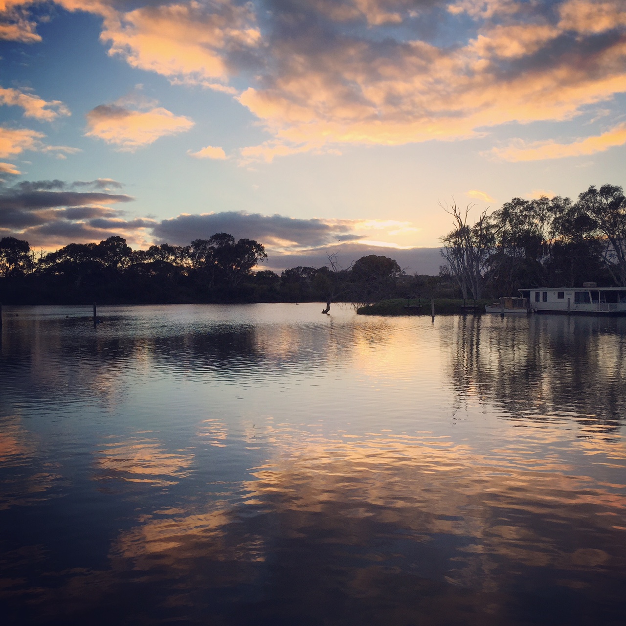
South Australia is my home, and I am proud to be South Australian.  No matter where I travel, I always look for Coopers Ale to drink (and it can be found in Tulsa, Oklahoma by the way)!

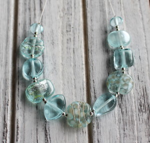
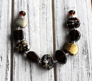
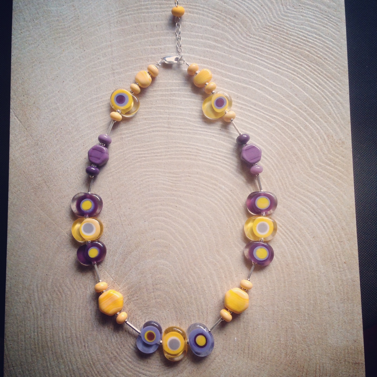
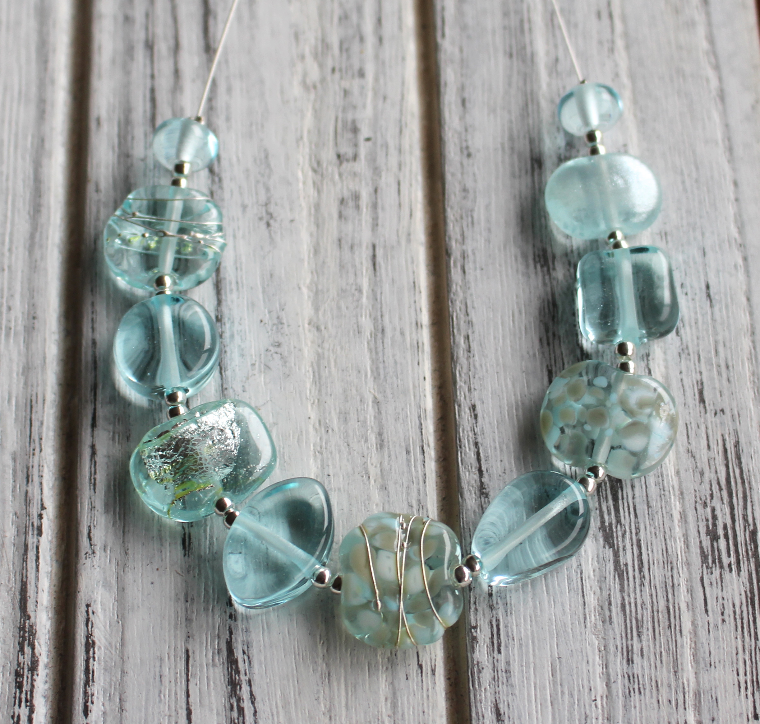
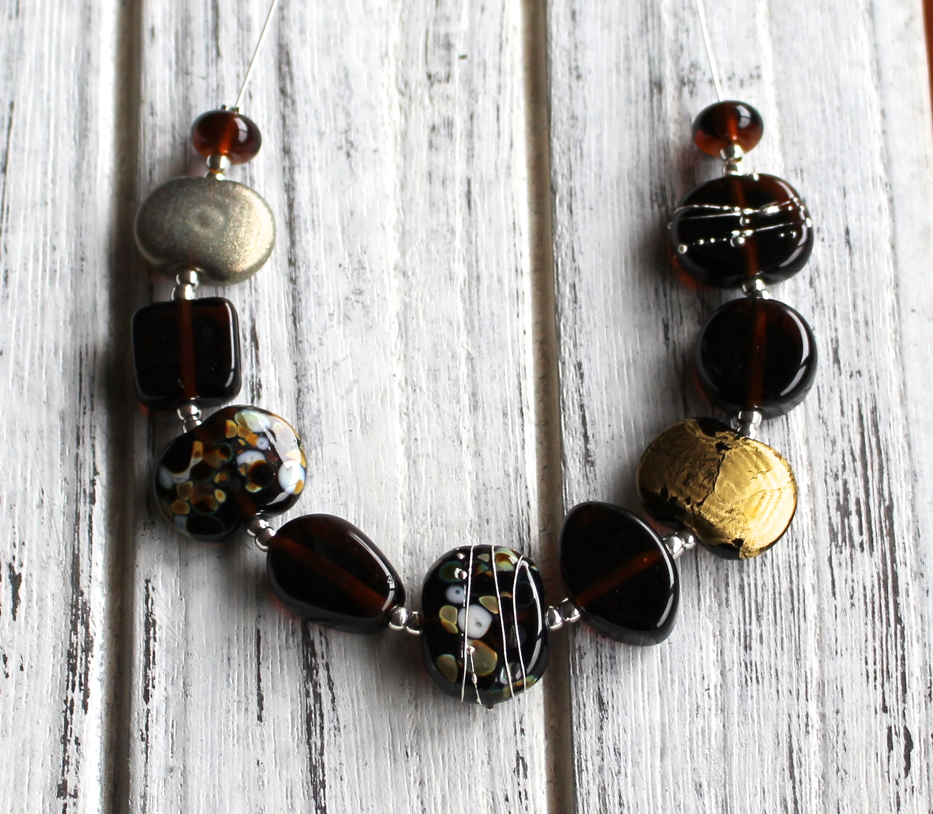
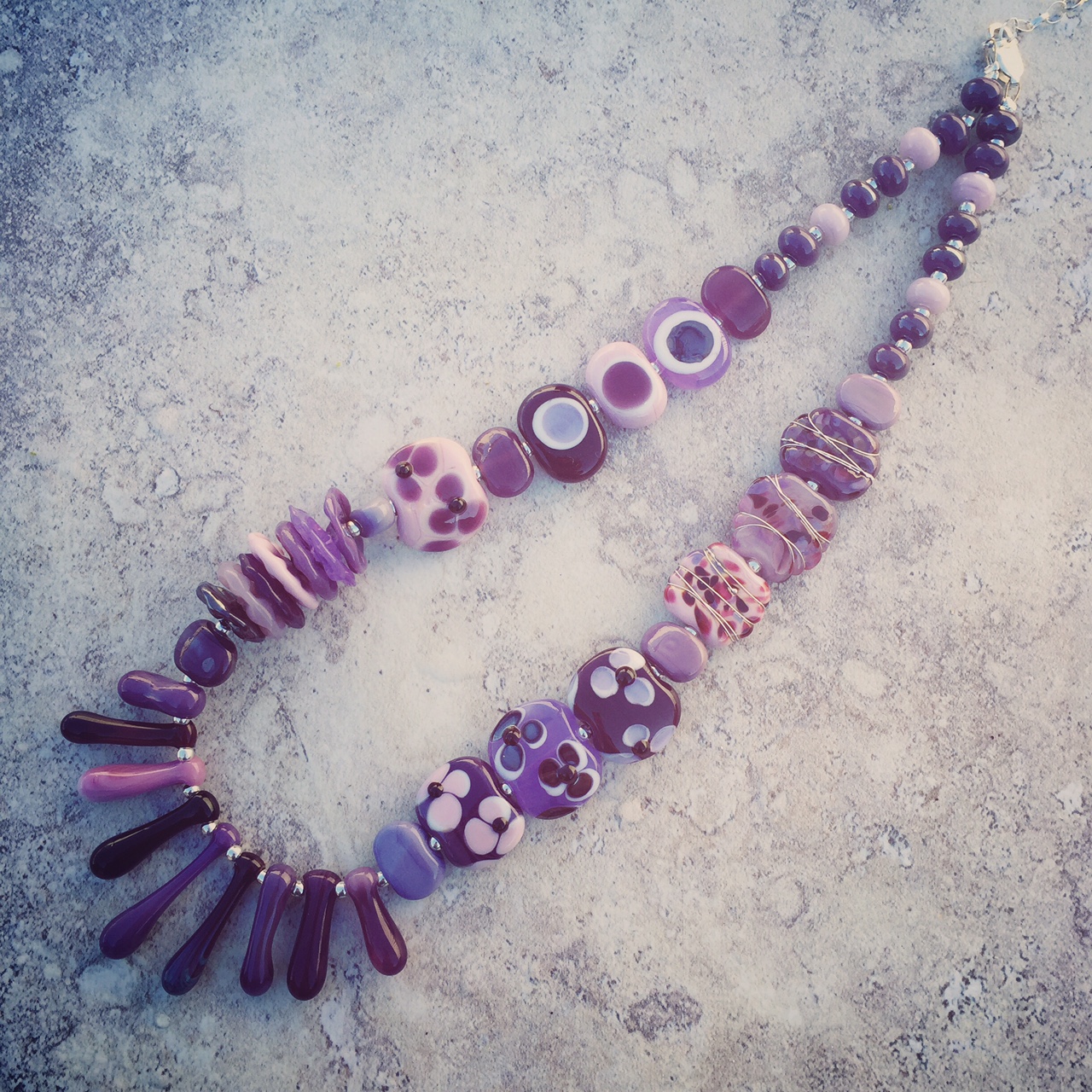
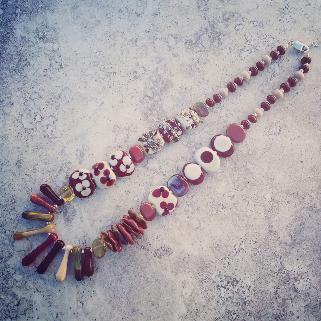
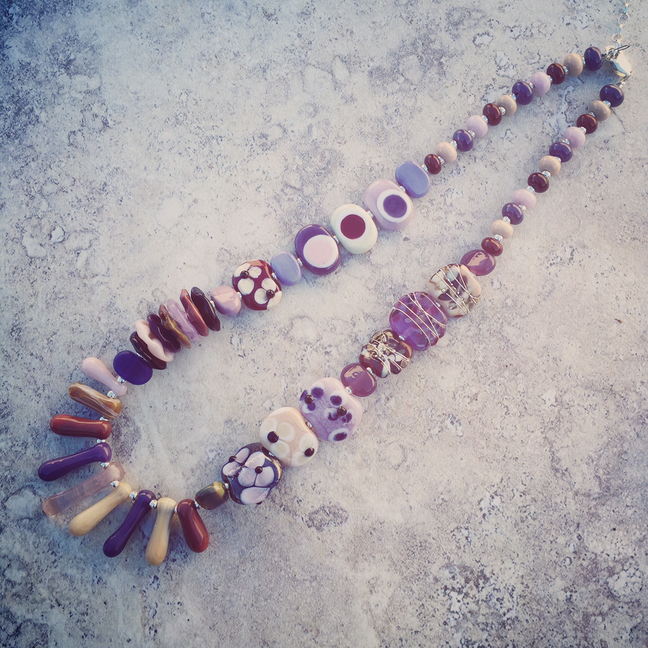
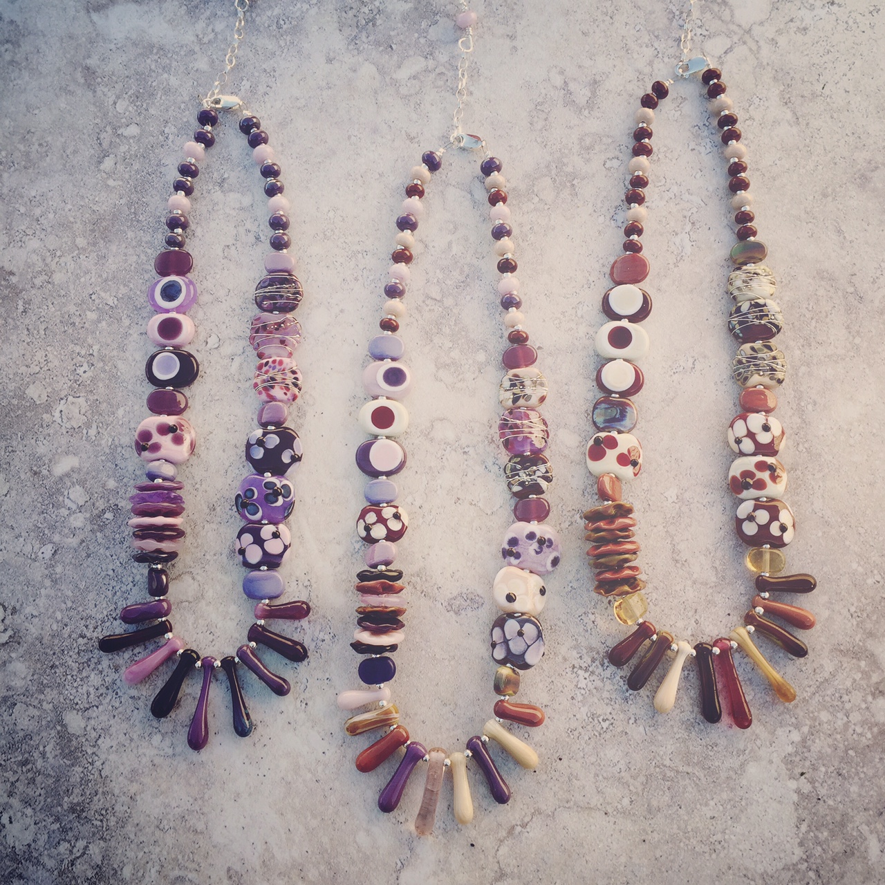
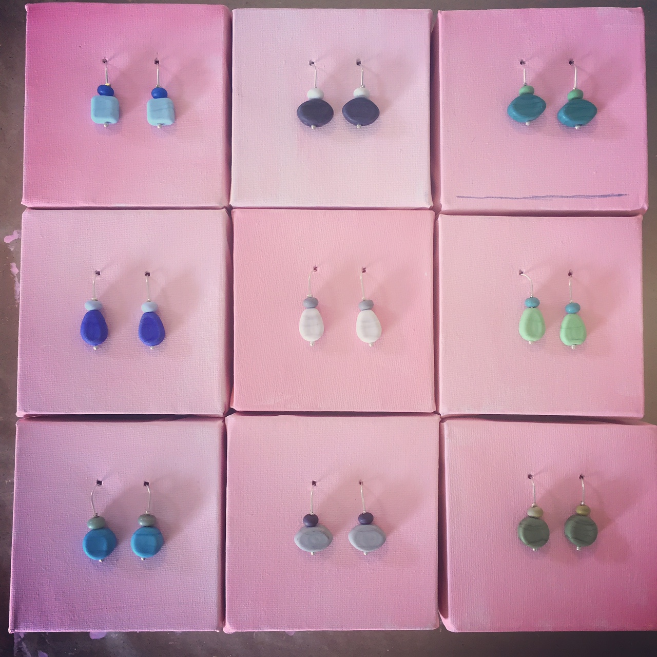
When I started recycling glass bottles to make beads, I deliberately picked two South Australian icons – Coopers and Banrock Station.  Both companies have very impressive environmental philosophies and standards, and that fit really well with the work that I was doing.

I have used most of the Coopers beer bottles, from Coopers Sparkling Ale to Coopers Clear.  And I have also used several of the Banrock Station wine bottles.  People must think I am very strange when I am in Dan Murphy’s and I am holding the wine bottle up to the light to see what colour glass bottle it is in!

To celebrate my award nomination, and to also celebrate the re-launch of ethikl (an online marketplace committed to selling items that are eco-friendly/ethically produced), I have loaded a selection of Banrock Station and Coopers Ale products into my ethikl shop, and discounted them by 10%.

Go South Aussies!

Banrock Station Wine Bottle Necklace

Coopers Sparkling Ale necklace

Posted on

The Colour Purple – with Brown

This is part of a series of posts about colour.  This month I am focusing on the colour purple.

Beautiful purple handmade glass bead necklace by Julie Frahm

Love this assorted brown handmade glass bead necklace by Julie Frahm

Combining purple and brown handmade glass beads by Julie Frahm

Love these purple and brown necklaces by Julie Frahm.  Handmade glass beads.

I was at a market a few weeks ago, and I had on display some of the new necklaces I was making, like the ones pictured above.  I had made them in 5 different colours (purple, brown, red, green and black/white).

The first necklace of the series to sell was the purple one.  I was lucky to get a photo of it, and if you click the link it will take you to a post about it.  As I was showing the range of necklaces, I had put the purple one next to the brown one, and thought to myself “wow, they look really great together”.

Funnily enough, the second necklace to sell was the brown one.  Unfortunately I did not get a photo of that one.

But, seeing those two colours together made me think: what about a necklace with both purple and brown beads?

So, I set out to make lots of purple and brown beads, and I was able to make this series of necklaces, that I am very fond of.  I knew that purple worked with lots of colours, but I had forgotten about brown.  How had I forgotten about brown?  (Answer: honestly, I think it’s because brown is not my first go-to colour choice).

It made me think about brown, a lot more than I have in the past, so much that I have decided that brown will be the colour of the month for June!

Next week I will have my final post about purple, and a surprisingly excellent colour that works well with it.

Posted on

On my walk this morning…

Morning walk by the River Murray

Things inspiring me right now:

  • The new book by Pip Lincolne – Craft for the Soul.  My heart races as I read it!
  • My shift at T’Arts on Saturday!  It was great to take everything off the shelf, and start again.  I was happy when I left, and even had a chance to think about some new work.
  • An afternoon at the Art Gallery of South Australia.  Yesterday was a stunning autumn day, and perfect for visiting the gallery cafe and indulging in a glass of bubbles.
  • Getting up and walking in the morning.  Yes, it’s getting colder, but that just means adding a pair of gloves and walking a bit faster.  A great way to start the day.
  • My kids!  After spending many hours out of the house over the weekend, away from them, it was lovely to come home and cuddle with them on the lounge, watching TV, while Nick cooked tea!  It’s lovely to have some time away from them every now and then, but it’s also lovely hanging out with them.

Hope you are having a great week.

Posted on

Retrospective!

Great selection of etched glass bead jewellery by Julie FrahmBlack and white handmade glass bead jewellery by Julie FrahmColour Wheel jewellery by Julie Frahm

I had to pick my work up from a little shop in Adelaide recently.  It was a tough decision, but with so many time constraints upon me, I just had to focus my energy in areas that were working.  I hadn’t sold any work in this little shop for many months, and I couldn’t find the energy to make more work in an attempt to increase sales there.  There was nothing wrong with the work that was there, it was just time to pack it up.

When it came time to look at the work that had been packed up, I was feeling very nostalgic.  It was work from the last few years of exhibitions that I have done.  The top photo was from my 2014 SALA exhibition.  The middle and bottom photos were from my 2013 Colour Wheel exhibition.  I loved putting those exhibitions together.  For both exhibitions I tried new things, some of which worked well, some not so well.

Looking at this old work from past exhibitions, reminded me to keep trying new things.  That is the point of exhibitions really.  It is lovely when the work you do resonates with people and they buy it, of course it is.  But more importantly for me is the making of new work.  The extra time I can spend dwelling on design, creating a cohesive exhibition of work, is worth it.  I love this time of year, a time to ferment and plan and plot out ideas for my next exhibition(s).  I can’t wait to see what comes out of my head this year for the 2 SALA exhibitions I am part of.

As you can tell, I loved seeing this old work again!  I will be taking it to markets in the near future, but if there is anything here that you like the look of, please send me an email.

Posted on

The Colour Purple – with a splash of red

This is part of a series of posts about colour.  This month I am focusing on the colour purple.

Beautiful selection of purple handmade glass beads by Julie Frahm

Love this purple handmade glass bead necklace by Julie Frahm

Last week I introduced you to the colour purple.  I mentioned that a lot of colours worked really well with purple.  I have quite a few favourite colour combinations that I particularly like, but my favourite is purple teamed with some red!

All shades of purple and red (even splashes of bright pink), work beautifully together to create really stunning necklaces.

This is mostly because red and purple are on the same side of the colour wheel, so when you use these colours they work well together in an Analagous Colour Scheme kind of way!

Posted on

On my walk this morning…

Morning Walk 11 May 2015


I nearly didn’t go for a walk this morning!  We had a big weekend visiting our mum’s for Mother’s Day.  I hadn’t slept very well most of the weekend.  So I didn’t set my alarm this morning, because I wanted to get as much sleep as possible.  When I woke up there was still time for a walk, and I’m glad I made the effort.

I’ve got lots to think about at the moment:

  • I was accepted to exhibit at the Adelaide City Library as part of their SALA Festival program.  Opening night will be 31 July.  My exhibition theme is “fleur verre” which means glass flowers in French.  Inspired by French painters, flowers and glass!  All the work will be made from recycled glass sources, and while I have a sketchy idea of what I am going to display, I also have a lot of work to do before the exhibition opens.
  • I was also accepted to exhibit at Pepper Street as part of their SALA Festival program.  The theme of their exhibition is “Renew“, and I will also have a selection of new recycled glass work available.  Again, ideas are floating around in my head for this one, but I will have to properly design it all soon so I can get started on the work.  July will be here before I am ready for it!
  • On Saturday I get to work in T’Arts, which I love!  I enjoy playing around with my display, meeting new customers, and looking at all of the wonderful work in the shop created by the artists who are part of the collective.

Have a great week.

Posted on

Mothers Day at T’Arts

MothersDay1MothersDay2MothersDay3

MothersDay4

Some of you will know that I am a member of the Textile and Art Collective known as T’Arts, which is located in Gays Arcade in Adelaide.

Each month the window display changes and a different artists is featured in the window.  At certain times during the year the entire collective gets involved with a window display, and at the moment our Mother’s Day window is officially open!

This is an extra special window, where members have been asked to donate small pieces of art, with all money raised being donated to the Breast Cancer Research Foundation.

I wasn’t sure what to donate as I don’t actually paint or draw.  I thought I would stick to what I could do, and that was make glass beads and jewellery!  But part of me kind of wanted to try painting too.

So, I compromised!  And I painted the little canvases pink!

Then I added a pair of my etched glass earrings.  All of my items will be for sale for $10.

I have had a look at some of the other work on display, and there are some really amazing pieces that artists have created, but work is selling really quickly too.  If you haven’t been to T’Arts for a while, now is a great time for a visit.